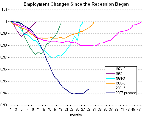
In the debate over April’s 290,000 jobs added VS April’s increase in the unemployment rate to 9.9 percent (which some claim is really 17.1 percent), this graph seems to best capture my sense of where we are at.
From Economix:

Source: Bureau of Labor Statistics
Horizontal axis shows months. Vertical axis shows the ratio of that month’s nonfarm payrolls to the nonfarm payrolls at the start of recession. Note: Because employment is a lagging indicator, the dates for these employment trends are not exactly synchronized with National Bureau of Economic Research’s official business cycle dates.
[Cross posted at No Quarter]
